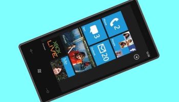
Last week, Microsoft finally launched Windows Phone 7, its all-out bid to stop the erosion of its rather dismal share of the smartphone market.
The run-up saw some unprecedented things: Steve Ballmer ate humble pie and took a salary cut over Microsoft’s mobile failure, and the new operating system, it was revealed, was not backward compatible with Windows Mobile 6.5.
 Microsoft’s mobile division had a clean slate then, and the launch held the final surprise. Not only has the company done a good job (at least from a first look at the product), but Apple-lover Stephen Fry stepped onto a Microsoft stage to say (unpaid) that the company had done something it could be proud of.
One week on from that event, I’ve been playing with a Windows Phone 7 device at eWEEK Europe (an LG E900), and what I have found pretty much backs up those first impressions. This is a phone which could entice consumers on board.
More importantly for our readers in the business sector, this phone could be the best thing for a long while for users at all-Microsoft companies. Instead of feeling burdened with the awful soullessness of Windows Mobile, these people stand to get the benefits of something other users may be jealous of.
Solid hardware, fluid user interface
The LG device I had didn’t impress an iPhone user in the office, who said it felt heavy and clumsy. I disagree. It’s only slightly bigger and heavier than our beloved Android device, the HTC Desire, and either has a much better screen, or else uses it better.
Microsoft has stopped allowing its operating system to be all things to all people. Windows Mobile was designed for use with a stylus and never had a good touch interface, with so many confusing menus it made Symbian look friendly. Now, it has a unified user interface, which is shown off to good effect on a set of phones that meet stringent hardware guidelines.
So let’s get hardware out of the way: the phone has three buttons. A “Start” button, with a Windows logo that takes you to the home screen, a back button and a search button. That cuts the number of keys of the Android platform, and it has no joystick/trackball affair because Microsoft is confident in its touch interface.
Other points to mention about the hardware include micro-USB charging, according to the ITU standard, which looks like finally getting widespread use. The charger on the LG is hidden under a rubber cover which feels reasonably robust, though I always fear this sort of thing is bound to break sooner or later.


