Microsoft Announces Windows 8 UI Features, Kills Aero Glass

Microsoft says the Windows 8 user interface will smash Aero Glass, but still retain elements from Windows 7
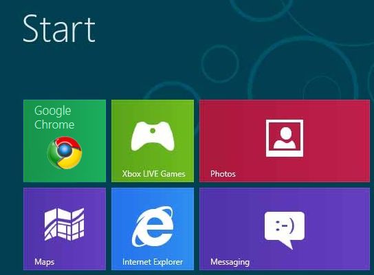
Microsoft has published a number of details about the new Windows 8 user interface (UI), and the biggest casualty appears to be the Aero Glass design, which was introduced in Windows Vista.
The latest version of the operating system aims to offer a fast, fluid, user experience while maximising battery life. Many of the changes being introduced reflect Microsoft’s belief that users now want a more mobile experience, and the company promises that the software will work equally well both on tablets and PCs.
RIP Aero
“We spent a lot of energy carefully considering how substantially to update the appearance of the desktop in Windows 8,” said Microsoft in a blog post. “Our primary goal was to bring visual harmony to Windows, while still preserving much of the familiar feel of the Windows 7 desktop and not sacrificing the compatibility of existing apps.”

“In the end, we decided to bring the desktop closer to the Metro aesthetic, while preserving the compatibility afforded by not changing the size of window chrome, controls, or system UI,” it added. “We have moved beyond Aero Glass — flattening surfaces, removing reflections, and scaling back distracting gradients.”
Microsoft notes that although the majority of the Metro UI uses white text on a colour-saturated background, Windows 8 will continue to use black text on light colour chrome. According to the developers, this decision was made to preserve maximum compatibility with existing programmes and avoid a repeat of the compatibility issues that arose when the colours changed from light on dark in Windows XP to dark on light in Windows 7.
“Aero was designed to help the app’s content to be the centre of attention, and for the Windows system UI to recede into the background,” explained Microsoft. “This is still relevant today, and while we are moving beyond Aero, we don’t want to lose sight of these goals.”
Portability rules
Microsoft said that it wanted to retain elements of Windows 7 so that users would feel comfortable, but acknowledged that the way people used their PC’s had changed. “Where connectivity was once the exception, it is now the rule,” noted the company, adding that people wanted their PCs to be more mobile and use features across several devices.

In response, every effort to maximise battery life has been made, especially with regards to memory consumption and multitasking. Background activity is to be kept to a minimum, but unlike with mobile devices, users will be able to multitask.
Touchscreen optimisation has also been a feature of the UI, but Microsoft says that it is not necessary to use any of the touchscreen features if they don’t want to.
Earlier this week it was announced that Microsoft had improved support for multiple monitors ahead of the operating system’s expected release later this year.
What do you know about operating systems? Find out with our quiz!