
Google has announced a number of changes to the Android brand, with one of the most notable developments being dropping the use of dessert or sweet names for internal codenames.
Ever since 2009, Android releases have been codenamed after sweets or desserts such as Android Gingerbread (version 2/3); Android Jellybean (version 4); and Android Nougat (version 7).
But this practice is being axed, and Google is also “refreshing” the look of the logo brand icon.

Google made the announcement of the evolving of the Android brand in blog posting by Sameer Samat, VP of Product Management at Android, during which he confirmed Google is changing the way its names its releases.
“Our engineering team has always used internal code names for each version, based off of tasty treats, or desserts, in alphabetical order,” wrote Samat. “This naming tradition has become a fun part of the release each year externally, too. But we’ve heard feedback over the years that the names weren’t always understood by everyone in the global community.”
He pointed out that some letters (such as L in Android Lollipop) are not “are not distinguishable when spoken in some languages,” and that some treats such as Pies or Marshmellows are not well understood in some parts of the world.
As Android seeks to be a global brand, going forward Google will name Android releases with numbers.
“As a global operating system, it’s important that these names are clear and relatable for everyone in the world,” wrote Samat. “So, this next release of Android will simply use the version number and be called Android 10. We think this change helps make release names simpler and more intuitive for our global community. And while there were many tempting “Q” desserts out there, we think that at version 10 and 2.5 billion active devices, it was time to make this change.”
And Google has also announced that it is tweaking its Android logo, by “introducing a more modern, accessible look.”
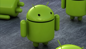
The Android robot stays, and the logo itself has been changed from green to black.
“It’s a small change, but we found the green was hard to read, especially for people with visual impairments,” Samat wrote. “The logo is often paired with colours that can make it hard to see – so we came up with a new set of colour combinations that improve contrast.”
Earlier this week Google confirmed it had shut down a programme that provided user data to mobile network operators, as a response to heightened scrutiny of the way companies handle customers’ personal information.
All Cybertrucks manufactured between November 2023 and February 2025 recalled over trim that can fall…
As Musk guts US federal agencies, SEC issues summons over Elon's failure to disclose ownership…
Moonshot project Taara spun out of Google, uses lasers and not satellites to provide internet…
Pebble creator launches two new PebbleOS-based smartwatches with 30-day battery life, e-ink screens after OS…
Amazon loses appeal in Luxembourg's administrative court over 746m euro GDPR fine related to use…
Nvidia, xAI to participate in project backed by BlackRock, Microsoft to invest $100bn in AI…


